SIGNS
The biggest reason was that it can be used not only for restaurants, cafes, and accommodations, but also in private rooms.
Just a small sign becomes a tool which expresses your good taste.
“SIGNS” — pictograms with minimal design make your space smarter and more stylish.
PRODUCT STORY Vol.3
— What made you decide to commercialize these kinds of pictogram signs?
First of all, I am a person who really likes pictograms. When I find cool signs inthe city or at some facility, I just cannot take my eyes off them. They fascinate me and I always observe them very closely.
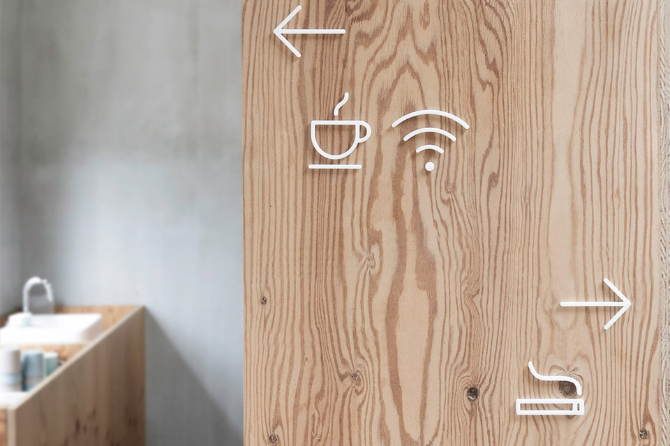
When you go to sophisticated commercial facilities or public spaces, you can invariably find beautiful and well-designed pictograms. When I see them, I have to admire them and am impressed by the design plan — “the planners thought carefully about the space and stuck to the details.” So, I have to admit that pictograms designs are a very good stimulation for my sensibility.
— I understand. There are some pictograms, as well as some fonts, which I find attractive.
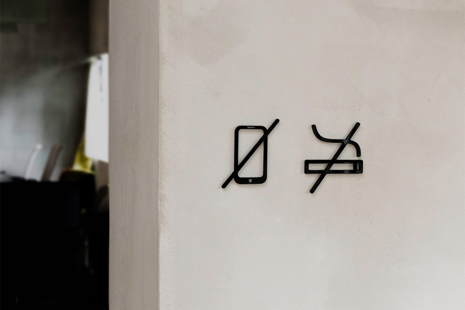
Pictograms are quite simple signs, but sometimes, they have a power to determine the atmosphere of the entire space. Just one sign can give a place a good quality or a cool ambience. On the contrary, it can also ruin the image and make the space seem tasteless.
Therefore, we can say that the existence of signage has a huge role and is particularly important for interior and space design, even if the signs themselves are small.
— Please let us know how highly-designed pictograms are produced.
The highly-designed pictograms which you find at commercial facilities or public buildings are mostly designed for each plan by the designers who are in charge of signage.
I would say, “a sign is not just a sign.” In most cases, these signs are designed and produced by certain graphic designers. But on the other hand, it means that these signs cannot be used or purchased generally even you are attracted by them, because they are original products of each facility.
— I see. So, we are disappointed by the fact that we cannot use sophisticated signs at home even though we discovered some nice ones…
That is the point. Pictogram signs should be in demand not only at big commercial facilities but also cafes, restaurants, small hotels, and guesthouses, etc.
I concluded that signs with a simple and smart design would be widely desired, and so I thought to myself, “why don’t I design my own pictograms and commercialize them?”
— What has the reaction been to these SIGNS?
I feel that many people really like our SIGNS. Not only in Japan, but also stores outside of Japan keep ordering them repeatedly, and I have noticed some positive reactions.
But the unexpected thing was that there is a pretty big demand for SIGNS in private homes, not just shops and facilities.
There are many users of SIGNS who post about it on SNS, especially on Instagram. The comments on posts which show SIGNS attached on doors are like…, “its simple and casual sense fits right in!” or “it is not too assertive, but cute and intelligible! The design is cool!” We are totally flattered.
Also, when we post photos related to SIGNS on Instagram, the numbers of “Likes” instantly goes up. Recently, interior space tends to be unified with clean design mostly colored inwhite. Then, if you are an invited guest in such a place, maybe you will find it difficult to find the door to the bathroom.
— Exactly. I might open the door with a guess “maybe this is a bathroom,” but instead go into a bedroom! This is common problem in stylish houses.
But if the door has a sign saying, “this is the bathroom,” the owner of the house doesn’t have to explain where it is every time, and a guest can find it at first glance. However, it would be unacceptable for you to put up a sign with a design you cannot stand. It can destroy the entire atmosphere of the interior, the space, and the house itself, we think.
— What were some things you were conscious of when you designed SIGNS?
When I think about the role of MOHEIM’s pictograms, only designing them stylishly is not enough and it is not the point.
I couldn’t consider a design that was eccentric, or too cutting-edged. The most important thing is that everybody thinks of it as “nice,” because its design issimple, clean, smart, and gentle…, and the design goes well with any places.
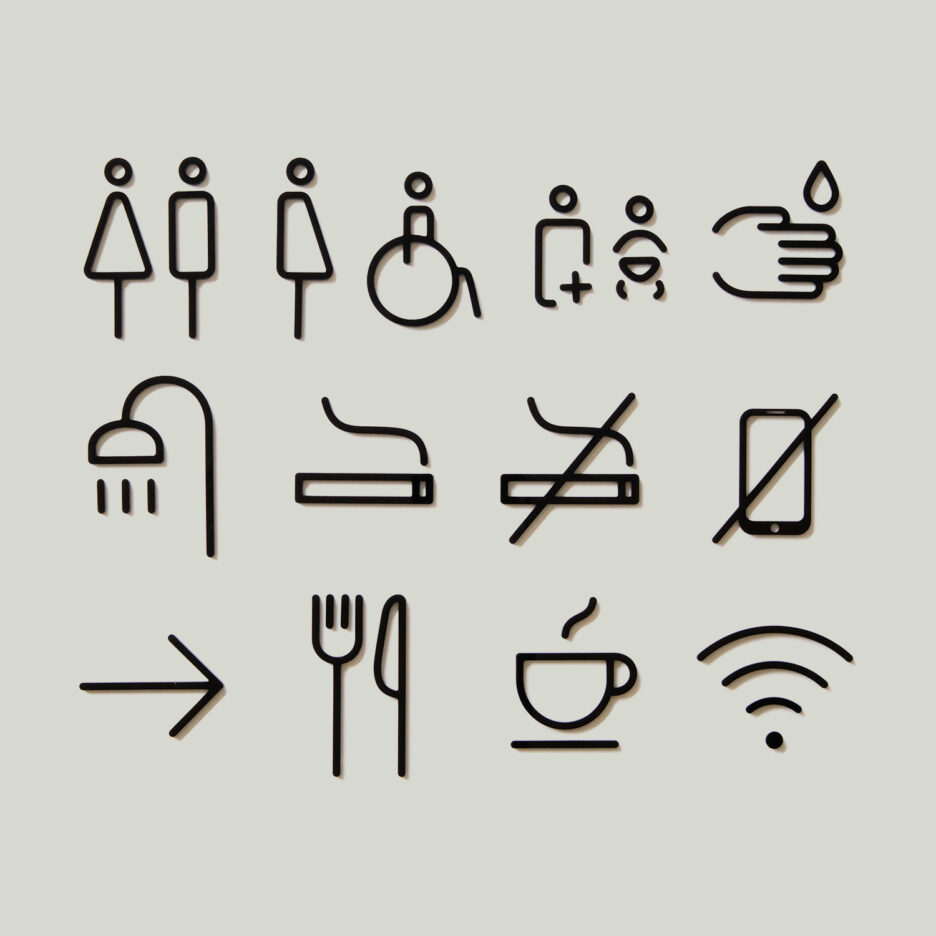
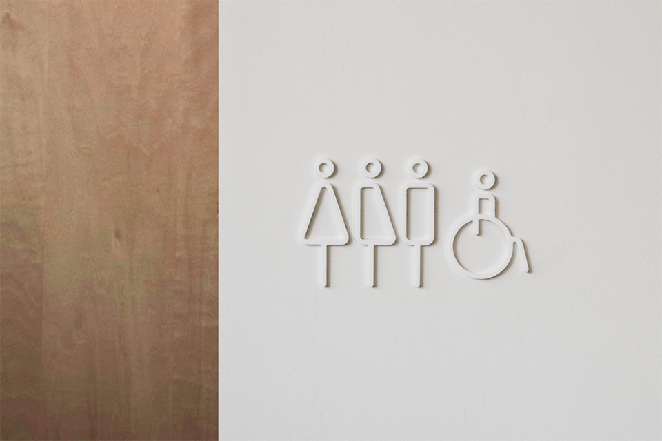
At first, we had been selling only RESTROOM SIGN. But this lineup has a genderneutral as well as an accessible sign, not just a man and a woman. It was our aim that these signs can be accepted widely, without distinction of the culture or backgrounds of society or country.
In particular, the reason we added a sign related to gender was in considering of the issue, “what is the standard for today?”
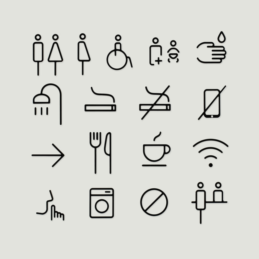
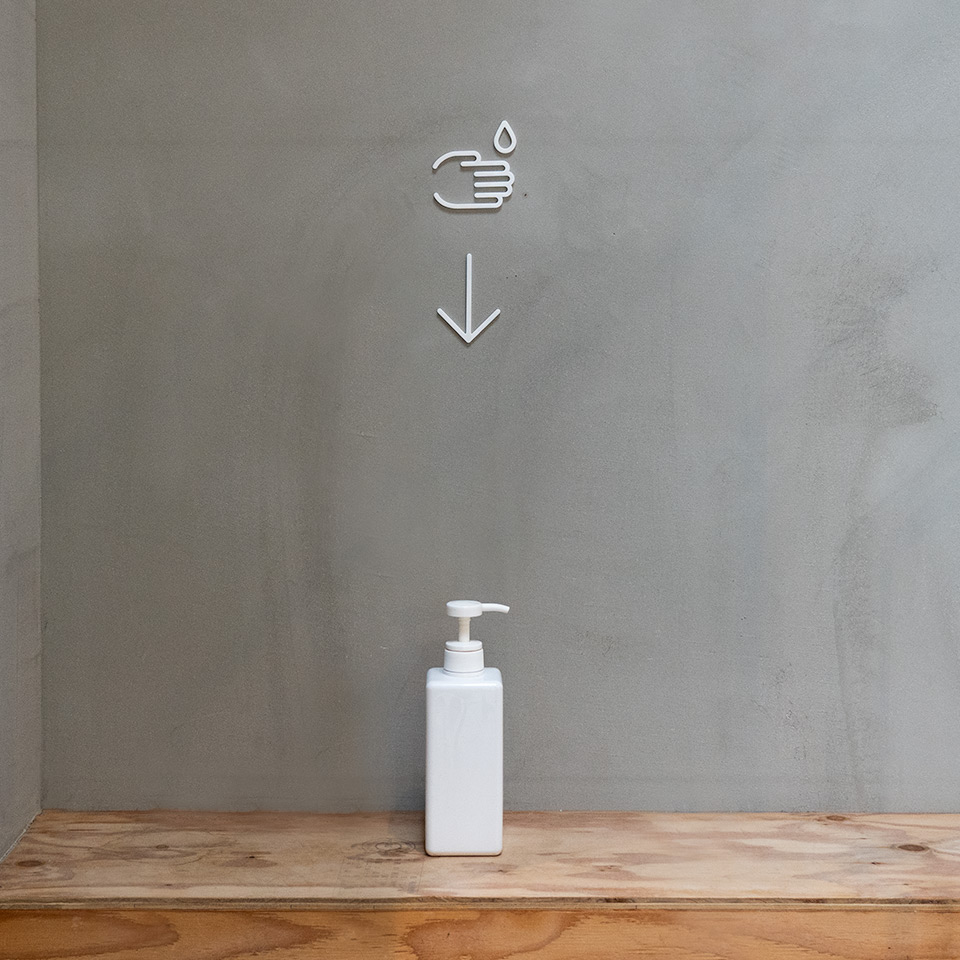
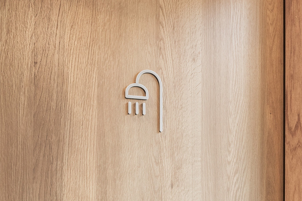
We added the signs “WASH HAND” and “SHOWER” in July 2020. And also, we introduced the color gray in addition to our 2 standard colors, black and white.
The gray color has a mild ambience and is highly recommended especially for interiors which are coordinated in white. Moreover, 8 more types of signs were added to the collection in September 2020. There is a wide-ranging lineup of SIGNS now available. For example, “WASH HAND” fits the present situation with “new ways of living,” and we wanted to add “Wi-Fi,” “NO SMOKING,” and so on, which are often seen in most public places. With the addition of “BE QUIET,” “LAUNDRY,” “DO NOT ENTER,” and “COUNTER,” the lineup will be even more varied, with more choices.
We would guess you cannot find this kind of unified design pictogram collection anywhere besides MOHEIM.
— Some signs consist of several parts, and each part is separate from other parts. Isn’t it difficult to correctly balance an entire sign when we attach it?
Actually, another characteristic feature of SIGNS is that you can attach them very easily.
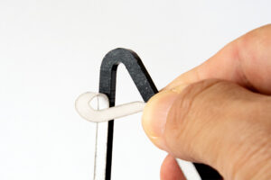
Adhesive tape is already attached to the back surface on each piece, so you can install the sign just by peeling off the release liner.
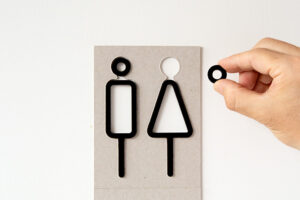
And also, the cardboard sheet included the package can be used as a guide. Put this sheet on the wall or the door where you want to attach the sign and check the balance, and then just put the sign parts in the appropriate place.
— It is nice to know that the package design can be used to mount the signs. As of now, what do you think about the lineup of all SIGNS?
Only RESTROOM SIGN was released in 2019, but I thought that it was just a beginning of the collection. Now, 13 types of SIGNS are available, and these are what I wanted to have when I thought about the design in the first place.
The variety of SIGNS is now plentiful, so we would like users to enjoy their own combinations of them which suit their interior or situations.
Each one has a length of 7-10 cm and a width of 4-8 cm, and is pretty compact. However, you will realize that these small signs definitely change the ambience of a space and make it beautiful. Please try them and discover the difference for yourselves!
Item information
