HORN
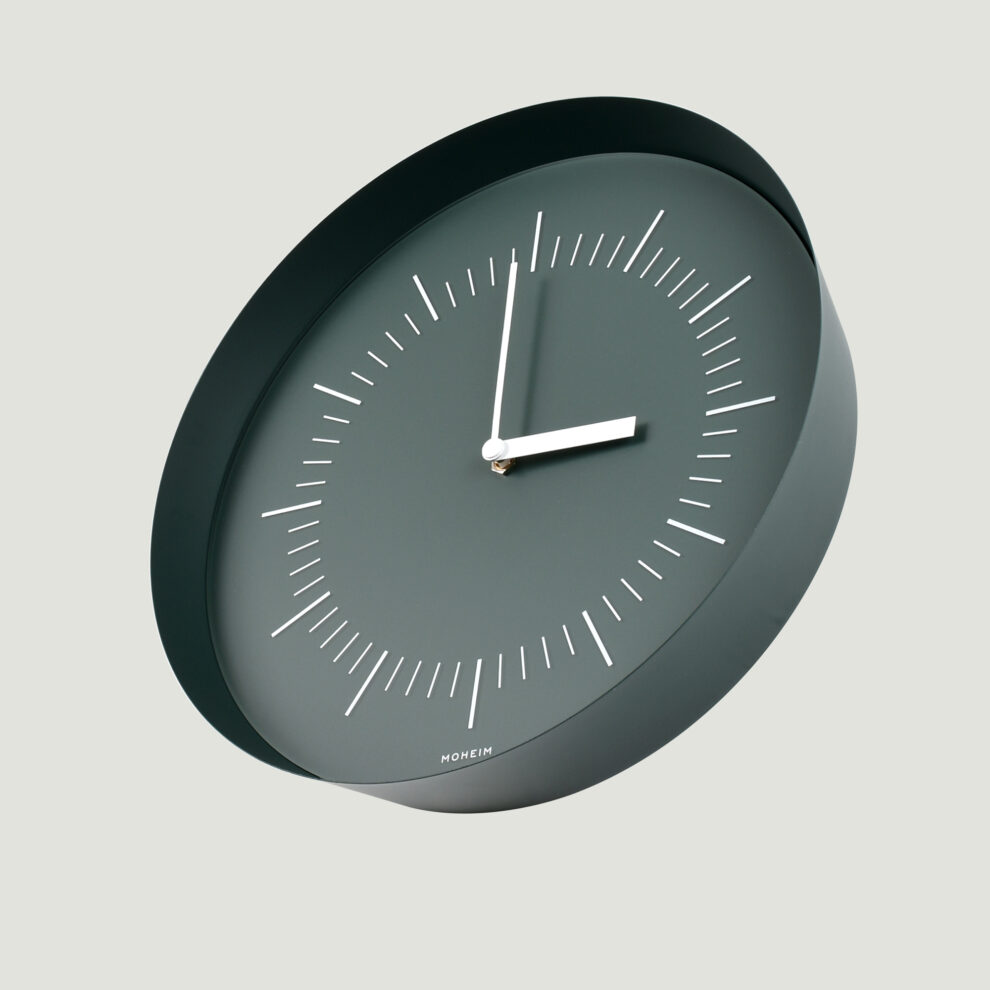
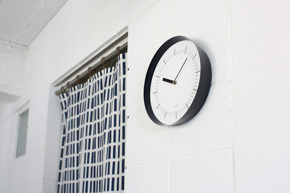
The thin frame has an exquisite angle which extends outwards, and it retains a sense of lightness and stability at the same time...
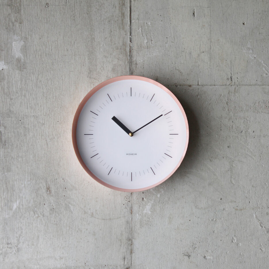
It looks just like a basic and simple clock from the front.
However, as you change your viewpoint, you will find a totally different look.
HORN’s pure appearance and tranquil sense of existence blend in beautifully
with the surrounding scenery, just like the flow of time.
PRODUCT STORY Vol.4
— First of all, could you tell us about the start of your collaboration with MOHEIM?
I had been acquainted with Shigeichiro Takeuchi, the creative director of MOHEIM, because we both graduated from same school, Kuwasawa Design School.
After Takeuchi established the brand, he asked me to come up with a wall clock design, as the second MOHEIM product following SWING BIN. He told me that “we would like to add another item into our collection, and that should be a simple and high-quality clock which also can be considered a ‘new-classic’ of wall clock style.”
He had been, and still is sympathetic with the design direction and philosophy of MUTE. Therefore, it seemed that he expected us to embody MOHEIM’s sense of values and to create something which harmonizes with the brand.
— What was the reason that you named this item “HORN”?
One is the form of the frame. It is pretty thin, and the shape widens as you move to the front from the back side. Another thing is how it is made, the technique of spinning metal. These 2 things are something it has in common with wind instruments. That is why I named it “HORN.” In the beginning, we were considering using brass as the material for the frame, so maybe this also influenced our naming of it.
And also, people used to use horns to announce the time in the past, didn’t they? This historical fact can be connected to the name of the clock, too.
— Could you tell us about the design concept of HORN?
In the first place, I started to think about how to keep the elements of the clockto a minimum. I wanted to design the clock to be as simple as possible, and tomake it fit into any kind of atmosphere.
When we think about the minimum elements of a clock physically, only 3 compositions are needed — the dial face, the movement, and the clock hands. But if we create a clock with only these 3 parts, it will be very unique and won’t be considered as a standard wall clock. Creating a clock with unusual or cutting-edge design was a totally different concept for us.
So, one of the most important conditions was using the elements of the clock with a minimum quantity. But we contemplated the “thinness of the frame,” “the angle of the extension,” and “the depth of the frame” for the clock to give it volume and still retain balance. This is what we were most particular about. When you want to check the time, you see only the face and hands of the clock. For any other moments apart from checking the time, we wanted HORN to keep an appropriate sense of presence for the space.
HORN truly looks like a simple circular wall clock when you see it from the front. But, as you view it from another angle…, you will get a quite different impression from it. This kind of visual difference, between the front and side views, is themost characteristic feature of this clock, we think.
— What is the reason you adopted the “Hera-shibori (metal spinning)” technique of Tsubamesanjo for the frame?
At first, we were planning to use a hard pulp, such as a vulcanized fiber, as a material.
However, we decided to adopt the metal spinning technique in the end. This is because we discovered that manipulating the steel with this technique could make the frame thinner while still retaining its strength. In addition, the face and movement could be affixed to the frame easily.
As a result, “a steel frame made with a metal spinning technique” became another characteristic feature of HORN.
— Did you have any difficulties, or go through any trial-and-error process duringthe design of HORN?
We made quite a few samples, especially to check the face of the clock — considering the visibility, the best way of printing for the acrylic plate, and soon.
At first, the clock had to have a conspicuous dial face, so I reconsidered its design many times. There are so many factors to consider with the visibility ofthe face: scales, thickness, and length of hands, and more than anything else, the balance when all of them are positioned together. It took a very long time to decide on the final design.
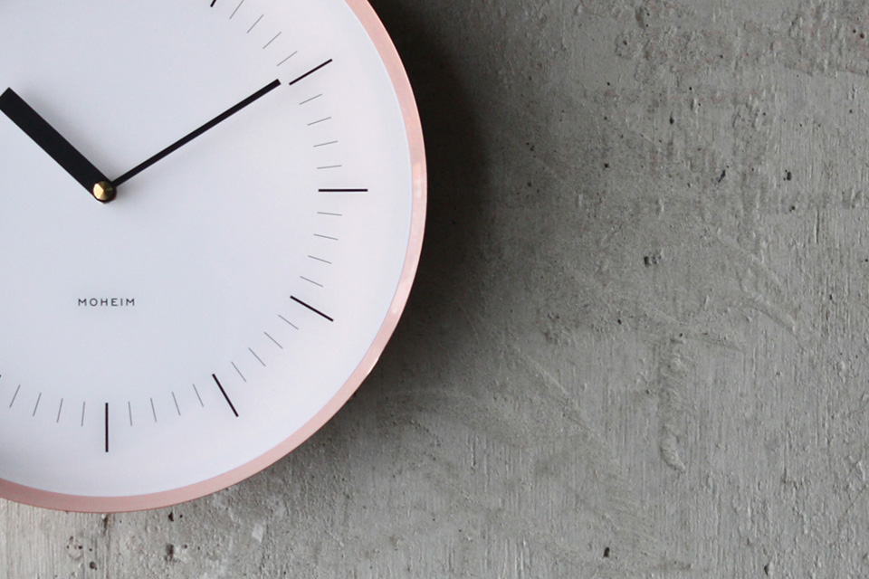
Another thing we considered was how to print the scales on the face. The scales are not printed on the white acrylic plate on the surface. Rather, the white base and scales are printed on the back side of a clear acrylic plate, and this effect makes the face looks solid and doesn’t give a cheesy impression.
— How did you decide on the color variation of HORN — copper, navy, and gray?
I was attracted to copper because the metallic color of this material and itssense of presence are refined.
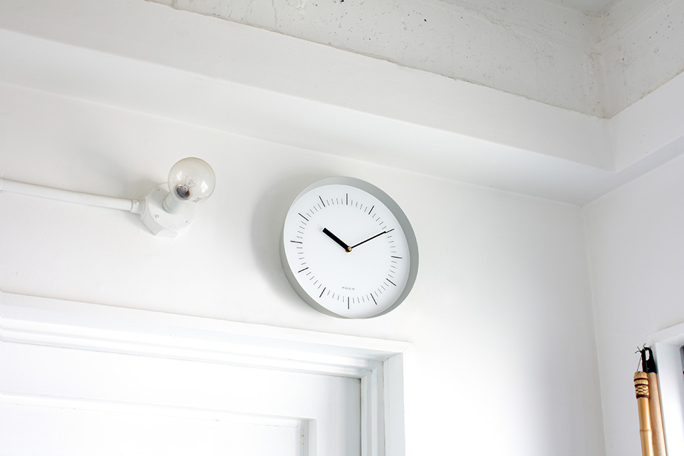
I also reflected on my ideas for both gray and navy. Gray is a kind of neutral color which can fit in various surroundings — for example, a room of minimal design, a space with a lot of wooden materials, an interior with colored wallpaper or painted walls, etc. Navy is a good match with a space based on white, and also goes well with a sort of retro atmosphere.
In addition, the navy color has a glossy texture, but the gray one is matte. That is because I wanted to emphasize the feel of the color to make each color more suitable for its environment.
— Please let us know your thoughts on this product as a designer.
HORN looks pretty simple viewed from the front, but it actually has a very unique design. However, it doesn’t mean that its uniqueness shows off its presence, and HORN doesn’t disturb the atmosphere of the spaces it is in. Therefore, it fits in anywhere. Its quiet figure suits any kind of ambience, so I would like people to use it in various places.
That is why HORN would be a nice choice as a housewarming gift. I would be delighted if you choose this as a present, so that both the person who gives it and the person who receives it are happy.
Item information
