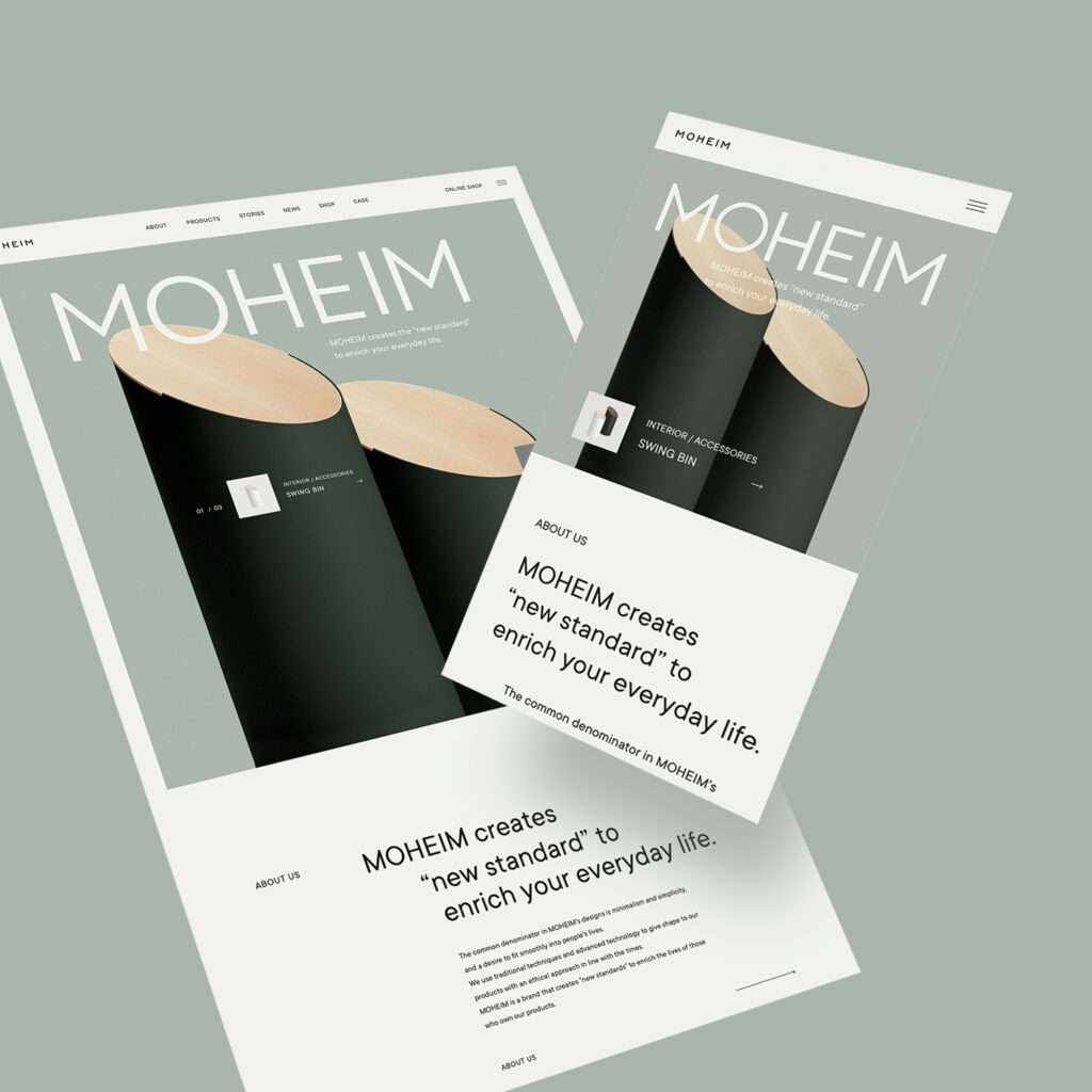
MOHEIM's WEBSITE
With this in mind, MOHEIM's website was designed and implemented with strict attention to quality, from the color design of the entire site to the layout and every single visual.
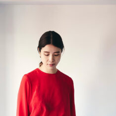
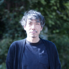
We interviewed “baqemono.inc (baqemono Inc.)” about the process of completing the website, which was designed based on the same concept as MOHEIM's "New Standard" products, and about the award it received at the AWWWARDS.

More beautifully, and more deeply.
Our website was renewed this spring with the aim of conveying the concept of MOHEIM more deeply than ever with beautiful visuals.
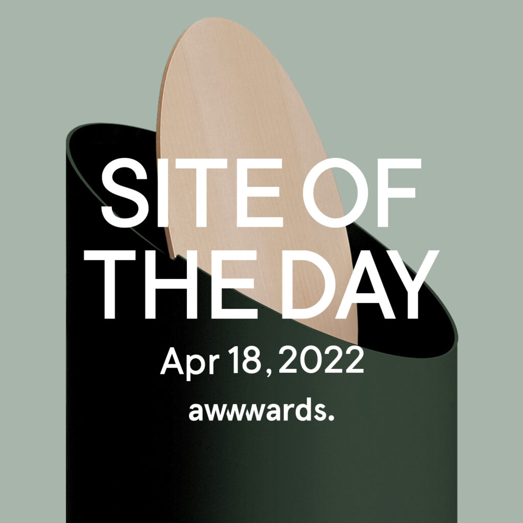
The web creative company “baqemono.inc” handled the composition, direction and design. This website won the “Site of the Day.” award on April 18, 2022 at the AWWWARDS, one of the “three major awards for web design.”
MOHEIM STORY
—— Thank you very much for your work on the renewal of MOHEIM’s website. First of all, I would like to ask you about the company “baqemono.” What are the thoughts behind the unique company name?
The origin of our company name comes from our desire to be “the one who transforms the client in a positive direction.” But beyond that, we also wanted to make our company name easy to remember and a little different from others.
It also means that we want to continue to enjoy “transforming” ourselves without fearing the evolution of technology and changes in the environment.
—— You call yourself a “professional studio for WEB.” What kind of work do you actually do?
Our work includes mainly design in the digital domain, such as websites and applications.
In web production, which is our main area of work, we excel in creative work that focuses on the quality of expression, such as design and animation, and aim to create products that are “intuitive, easy to use, and resonate with the user’s emotions.”
—— With this in mind, what are the areas you focus on in your work?
As for our particular approach and the philosophy that we value in our work… First and foremost, we place great importance on “working with the person in charge of the project,” and “making progress as a two-person, three-legged team” through repeated discussions.
In the actual production process, we are committed to providing “creativity that works for the purpose” by incorporating the theory we have developed based on data and the knowledge and sensibility we have cultivated through our experience.
—— We feel that the creation of the MOHEIM website was truly a “three-legged race.” During the design process, we discussed ideas together with MOHEIM director Shigeichiro Takeuchi.
As we continued our discussions with each other, the most significant change in the design was the “color design” of the site as a whole.
The initial design proposal we presented was monochrome in tone and used mainly low-saturation images.
However, Director Takeuchi commented that this would not express the characteristics of the brand, such as the fact that MOHEIM products are available in a wide range of colors and that the products “fit into the lives of the people who own them.” So we decided to incorporate this into the design to
match the brand image.
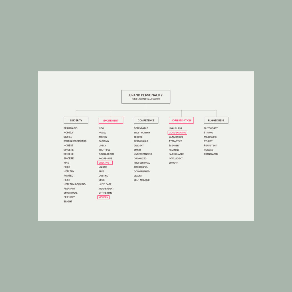
—— What did you think of our request for a site that was “not only simple and minimalist, but also beautifully detailed and modern” ?
First, we needed a process to deepen our understanding of the orders we received, and since Takeuchi and I were both designers, albeit from different fields, we were able to communicate easily by bringing together multiple frames of reference.
However, once we started the actual production, I remember that “just simple and beautiful” was not enough to express “MOHEIM’s charm that combines subtlety and presence,” and we had a hard time expressing a “hook” that would leave a lasting impression on people who viewed the site.
—— What were some of the things you focused on while actually working on the project? Were there any difficulties or hurdles?
As for the aforementioned “hook,” we were very particular and went through a considerable amount of trial and error to find the right expression.
As we continued to experiment, we took a hint from MOHEIM’s concept of “creating a new standard” and came up with the policy of “adopting a site layout that is unparalleled by other competing sites, while at the same time producing a design that gives a strangely well-formed impression,” and we proceeded to adjust that balance through a series of trial-and-error processes.
—— I heard that you had the idea of “not focusing on creating something that is easy for everyone to use” as you proceeded with the renewal. Please tell us more about this commitment.
Originally, the purpose of the renewal was to “improve usability,” but we told them that if they focused too much on improving usability alone, it would not lead to a good result.
Usability (ease of use) can be easily understood by comparing it to clothing. If too much functionality is sought, design and uniqueness will fall as a trade-off.
Just as you would not go to a formal event dressed for camping or playing soccer, it will be difficult to resonate with “easy to use for everyone ≒ familiar site design” when transmitting information to the “highly sensitive” target audience for a site or product.
Therefore, we suggested that “improving usability should not be the primary goal of the site renewal” when creating a unique design that is in line with the brand identity.
—— Can you give us some other specific examples of what you focused on?
MOHEIM’s website actually has many “small details” that are important to us. For example, when you access the top page, you will see a box in the lower right corner that says “Click here to sign up for our newsletter.” If you hover your mouse over the email icon while viewing the site on a PC, the icon changes to a paper airplane, and the smartphone image at the bottom of the page moves as you scroll.
Maybe people wonder “what’s the point of being particular about that?” However, we believe that focusing on the smallest details will improve the overall quality of both the site and the product.
I think this is the same philosophy as Director Takeuchi’s attitude of thoroughly thinking through every detail of the design.
—— MOHEIM’s website, which was created with such care and attention, was awarded the AWWWARDS* “Site of the Day.” How did you feel when you received the award?
We were honestly happy to receive this award, as it has been our goal since the beginning of our career as web creators. We were also happy that we were able to respond to the various requests we received when creating the site, and that we were able to give something back to the people who trusted and entrusted us with the general framework of the site with the goal of expanding the recognition of MOHEIM.
—— It was a pleasure to work with you to create a very attractive website. Thank you very much.
“AWWWARDS” is a gallery site and organization that awards the most outstanding websites by evaluating and scoring the websites sent in daily by prominent designers and art directors from around the world.
The awards recognize the efforts and talents of the world’s best web designers, developers, and production companies, and are considered one of thetop “three major web design awards.” With some creative designers aiming to be included in the AWWWARDS, those receiving awards are interactive and up-and-coming.